Matplotlib is a powerful library for creating data visualizations in Python. It provides a wide range of graph types, from basic line plots to complex 3D visualizations. However, there might be instances where the default graph types in Matplotlib do not meet your specific needs. In such cases, you can extend Matplotlib by creating your own custom graph types. This blog post will guide you through the process of extending Matplotlib and creating custom graph types.
Prerequisites
To follow along with this tutorial, you will need the following:
- Python installed on your machine
- Matplotlib library installed (
pip install matplotlib) - Basic knowledge of Python and Matplotlib
Getting Started
The first step is to import the necessary libraries and modules. Along with Matplotlib, you might also need NumPy for handling numerical operations and Pandas for data processing. Open your Python editor or Jupyter notebook and import the required libraries as follows:
import matplotlib.pyplot as plt
import numpy as np
import pandas as pd
Customizing Existing Graph Types
Before diving into creating entirely new graph types, you can start by customizing the existing ones in Matplotlib. This can be done by manipulating various aspects of a graph, such as colors, line styles, markers, and labels. Let’s see an example of customizing a line plot:
# Create sample data
x = np.linspace(0, 2*np.pi, 100)
y = np.sin(x)

# Customize the plot
plt.plot(x, y, color='red', linestyle='--', linewidth=2, label='Sine Wave')
plt.xlabel('X-axis')
plt.ylabel('Y-axis')
plt.title('Customized Line Plot')
plt.legend()

# Display the plot
plt.show()
In the above code snippet, we create a line plot of a sine wave and customize it by changing the color, linestyle, linewidth, and adding labels and a title. Feel free to experiment with different customization options to create unique visualizations.
Creating New Graph Types
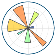
If the existing graph types in Matplotlib still do not fulfill your requirements, you can create your own custom graph types using Matplotlib’s object-oriented API. This allows you to have more control over the graph’s elements, such as axes, figures, and subplots. Let’s take a look at an example of creating a custom polar plot:
# Create sample data
theta = np.linspace(0, 2*np.pi, 100)
r = np.sin(theta)

# Create a polar subplot
fig, ax = plt.subplots(subplot_kw={'projection': 'polar'})

# Plot the data
ax.plot(theta, r, color='green', linewidth=2)

# Customize the plot
ax.set_title('Custom Polar Plot')

# Display the plot
plt.show()
In this example, we create a polar plot by specifying the projection parameter as 'polar' when creating the subplot. We then plot the data using the plot method of the ax object. Finally, we add a title to the plot using the set_title method of the ax object.
Conclusion
Matplotlib is a versatile library for creating data visualizations in Python. By customizing existing graph types or creating your own custom types, you can tailor your visualizations to specific requirements. This blog post provided an introduction to extending Matplotlib and creating custom graph types. Experiment with different customization options and explore the Matplotlib documentation to discover the full potential of this powerful library.